Wednesday, 7 October 2009

Glowing Edges Filter


This is the glowing edges filter which I found in the filter gallery on photoshop. I set the edge width to 10, the edge brightness to 4 and the smoothness of the lines to 15. This created this effect where the main parts are outlined and the rest is darkened. I like how this has created a very abstract look to the original photo.

Emboss Filter


This is the emboss filter that can be found on the filter menu in photoshop. I set the angle to 131 degees, the height of the embossing to 100 pixels and the amount of embossing to 500%. This creates a very, very abstract image of the original that looks totally different. It has created two layers coming off one another and very abstract colours in the sky and on objects for example.

Cutout Filter


This is the cutout filter, which makes the photo simplify into basic shapes and the levels of detail can be altered. I set the number of levels to 8, the edge simplicity to 10 and edge fidelity to 3. These settings created an image that has less detail than the original but enough so that you still know what it is. I like the way that the bushes have two layers of cutout not making them completely flat.

Using Colour Brushes

I took this photo in St Ives, while on my holiday. I saw this Banksy style graffiti on a wall. In this photos I have used the paint brush tool, to change the colours of the swans on the wall. I coloured in all the different parts of the graffiti in different colours to make the image look different to the original one. The best bit I think is the group of swans on the right because of the different colours all put together.

Warming Up Images

In this photo i used the photo filter, and selected the warming filter (85) and set it 46 on the slider. This created the effect on the right, it has made the whole picture more orange and creates a more sunset like feel to the image that the original. I like the way it has reflected the redness of the sky into the water below, this change of colour changes the mood in my opinion.
Below is a screen-shot of how i changed the warming density etc.

Wednesday, 30 September 2009

David Lachapelle

David Lachapelle is an American photographer and music video/adverisment director, who who works in fashion, advertisment and fine art.
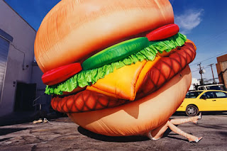
His work is noted for its very surreal and outlandish images, which in most cases use digital editing techniques to make them seem much more surreal. Also by using these digital techniques he can make the colour much more vivid which adds to the surrealism of his photographs. An example of these is shown on the left. the main object, the burger, has been layed on top of another image, then edited to make it seem as if it actually happened e.g. the shadow was put in.
In the one on the right i like the way that there are lots of things going on, but that the main image of the women holding the baby stands out a lot. The bold red colour really catches the eye of anyone that views the image. To add another edge of surrealism the women is lying down as her head is rested on the pillow, but at a first glance you don't notice this.

Colour Variation

Another way to alter colour in a image is by using the colour variation window, like the screenshot below. This tool allows you to see both images, before and after, and you can add red, blue, green and lighness to an image in stages. it also allows you to subtract colour so you can achieve the desired colouration effect. In my pictures I used this tool so that the green in the grass was more vivid and the whole picture was less washed out. The tool allows you to change the colours in the midtones, highlights, shadows and saturation. You can also increase the density of the colour adjustment on each stage.