Monday 28 September 2009

Changing Colour in Sections

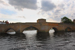
Another way to change the colour in a photo is by selecting one section of it, in this case the bridge, and adjusting the hue/saturation of that particular part.
- Firstly I unlocked the background layer and then created a new, blank, layer on which I would put the copy of the bridge.
- Next, I used the magnetic lasso tool to go around the outline of the bridge, then I copied it and pasted it into the blank layer, in the same position as the original bridge.
- This copy of the bridge is on top of the original photo so when the colour of it is adjusted it is the only thing that is changed, not the whole photo.
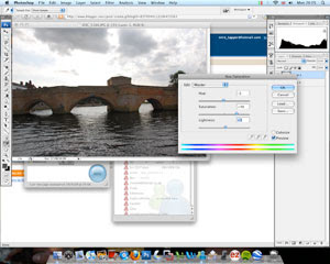
- I adjusted the hue from 0 to -3, the saturation from 0 to 48 and the lightness from 0 to 5. this is shown in the print-screen below.


Colourising Photos

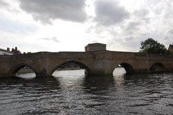
Another way to change the colour of an image is to colourise it which involves changing the whole colour scheme of the image so that it is all different tones of one colour, in this case a sepia brown colour.
To colourise the picture (right), I had to go to the same box as the hue/saturation tool, and click on the 'colourise' tick box. Then I had to change the 'hue slider' to a colour which I feel best suited the photograph. This effect has made the photo look like an old style camera. I like the way that there are different tones of the brown colour throughout the image.

Adjusting Hue and Saturation

There are 3 variables that can change the colour of a photograph, they are hue, saturation and lightness.
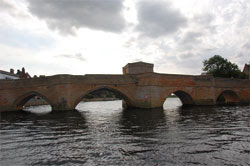
On these photos I changed the hue and saturation to bring out the colours on the bridge and in the sky.

- Firstly I unlocked the background layer so it could be altered.
- Then I copied the layer so that when I adjusted the hue and saturation it wouldn't be too bold and it will blend the colour of the two layers, while changing colour.
- Then selected the sky area using the magnetic lasso tool, with a 10
0pt feather effect so there were no rough edges, and then adjusted the saturation from 0 to 42 on the slider. I thought this was enough so that it didn't become overly saturated.
- The next thing I did was, once again, select the bridge using the
magnetic lasso tool, and adjusted the saturation from 0 to 47, and this time I adjusted the hue a little, from 0 to 7. This has made the bridge brighter and I shows the colours of it much better, in my opinion.