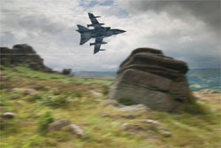
This photo is two photos put together to make one photo, this is composition. First I got the
two separate images, the plane on its own and the rocky landscape.
1. First thing to do was to select the outside edge of the plane from its original background, which in this case was just plain white, which made it a lot more easier to select using the
magic wand tool. After this I right clicked and
inverted the selection so that the plane was just
highlighted.
2. Then I
contracted the selection so it was tidier, and to make it more of a
realistic composition.
3. Then I
copied the plane into the background image and began to change it to make it fit in, in a realistic way.
4. The first thing for this was to
re size the plane so that it looked in
proportion with everything else in the picture.
5. I then
rotated it a bit so it didn't look like it was flying into the rock. Once I had done this I
duplicated the layer, so I could
add blur to the plane to create the speed.
6. I then, using the
blur filter, added some
motion blur to the plane. Then because I had duplicated the layer I could now rub out the front edge of the plane to make it look like it was traveling in one direction.
7. The next thing I had to do was to blur the background, once again using the
motion blur, but this time I made the
distance of the blur to 40pt instead of 15pt for the plane, this made the plane look like it was going faster.
8. The last thing i did was to create speed lines coming off the ends of the planes wings, I did this by
selecting the areas I wanted and
creating a new layer, then I
filled the selection area with white and set the
opacity to 20%. This created the final lines you can see in the picture.


These are the original pictures.

 These are the pictures used to create my final image
 For this composition I did a very similar thing to the last post, however I had to crop the background image so that the picture was framed better.
 This photo is two photos put together to make one photo, this is composition. First I got the two separate images, the plane on its own and the rocky landscape.


 Once again i have edited this photo on the left to change the mood. However this time have created a darker, more scarier mood, by using a cooling filter (82) with a density of 26%. Then I felt that wasn't enough so I adjusted the brightness from 0 to -106. This created the very dark and somber mood present. Below are the two screen shots that changed the photo:


 The photo on the left is one I took recently and I have used the an orange photo filter with an 87% density. The photo on the right is the finished one and it has a significant change to it. Adding the filter has changed the mood to a more warming and inviting one. Below is the print screen of the process:


 I took this photo in St Ives, while on my holiday. I saw this Banksy style graffiti on a wall. In this photos I have used the paint brush tool, to change the colours of the swans on the wall. I coloured in all the different parts of the graffiti in different colours to make the image look different to the original one. The best bit I think is the group of swans on the right because of the different colours all put together.

 In this photo i used the photo filter, and selected the warming filter (85) and set it 46 on the slider. This created the effect on the right, it has made the whole picture more orange and creates a more sunset like feel to the image that the original. I like the way it has reflected the redness of the sky into the water below, this change of colour changes the mood in my opinion.