


 Below is the final picture after being warmed:
 I was happy with this as a final image but then I started to play around with the photo filters, and I added a warming filter to the image and it turned the sky a purple colour which I felt was a much more vivid colour. Below is the creenshot of the two together in photoshop:
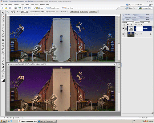


 Martha Rosler is an American artist who creates these quite, at a glance realistic, montages, but after looking at it further you can see the cleverness of how they are put together. She uses images from times when only black and white camera were used and modern photos, but the way she makes them interact is what I like about these images. There is also a mixture of of moods in the montages aswell as there is war-like scenes and models. This is a very surreal thing and it makes the images more in depth than they first appear.

 Hannah Hoch is a german artist, who's work includes these photo montages, which I think are very effective as they incorporate a varying range of objects and people that don't really create anything in particular but they are very abstract and in some cases very surreal. I like them as they are very weird and the way the different things are put together is very clever.


 Stop motion animation is where individual photographs are taken of an object. In each photo the object has been moved slightly. Once all the pictures are put together the animation is very jerky and creates the effect that the object is moving. This can be very abstract as any object can be moved making stop motion animation a very arty form of animation. Sometimes clay figures are used in this animation as they can be repositioned easily and stories can be created using the models e.g. 'Morph'.
 These are the pictures used to create my final image
 For this composition I did a very similar thing to the last post, however I had to crop the background image so that the picture was framed better.
 This photo is two photos put together to make one photo, this is composition. First I got the two separate images, the plane on its own and the rocky landscape.


 Once again i have edited this photo on the left to change the mood. However this time have created a darker, more scarier mood, by using a cooling filter (82) with a density of 26%. Then I felt that wasn't enough so I adjusted the brightness from 0 to -106. This created the very dark and somber mood present. Below are the two screen shots that changed the photo:


 The photo on the left is one I took recently and I have used the an orange photo filter with an 87% density. The photo on the right is the finished one and it has a significant change to it. Adding the filter has changed the mood to a more warming and inviting one. Below is the print screen of the process:


 I took this photo in St Ives, while on my holiday. I saw this Banksy style graffiti on a wall. In this photos I have used the paint brush tool, to change the colours of the swans on the wall. I coloured in all the different parts of the graffiti in different colours to make the image look different to the original one. The best bit I think is the group of swans on the right because of the different colours all put together.

 In this photo i used the photo filter, and selected the warming filter (85) and set it 46 on the slider. This created the effect on the right, it has made the whole picture more orange and creates a more sunset like feel to the image that the original. I like the way it has reflected the redness of the sky into the water below, this change of colour changes the mood in my opinion.
 David Lachapelle is an American photographer and music video/adverisment director, who who works in fashion, advertisment and fine art.

 Another way to alter colour in a image is by using the colour variation window, like the screenshot below. This tool allows you to see both images, before and after, and you can add red, blue, green and lighness to an image in stages. it also allows you to subtract colour so you can achieve the desired colouration effect. In my pictures I used this tool so that the green in the grass was more vivid and the whole picture was less washed out. The tool allows you to change the colours in the midtones, highlights, shadows and saturation. You can also increase the density of the colour adjustment on each stage.