Wednesday 30 September 2009

David Lachapelle

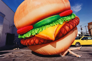
David Lachapelle is an American photographer and music video/adverisment director, who who works in fashion, advertisment and fine art.
His work is noted for its very surreal and outlandish images, which in most cases use digital editing techniques to make them seem much more surreal. Also by using these digital techniques he can make the colour much more vivid which adds to the surrealism of his photographs. An example of these is shown on the left. the main object, the burger, has been layed on top of another image, then edited to make it seem as if it actually happened e.g. the shadow was put in.
In the one on the right i like the way that there are lots of things going on, but that the main image of the women holding the baby stands out a lot. The bold red colour really catches the eye of anyone that views the image. To add another edge of surrealism the women is lying down as her head is rested on the pillow, but at a first glance you don't notice this.

Colour Variation

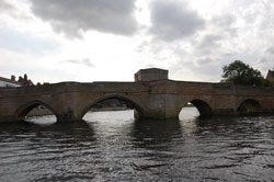
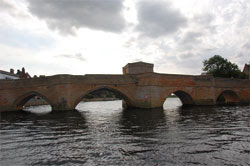
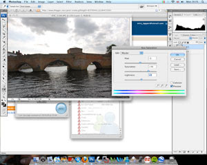
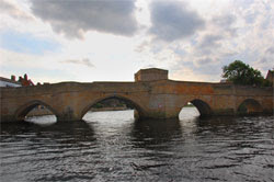
Another way to alter colour in a image is by using the colour variation window, like the screenshot below. This tool allows you to see both images, before and after, and you can add red, blue, green and lighness to an image in stages. it also allows you to subtract colour so you can achieve the desired colouration effect. In my pictures I used this tool so that the green in the grass was more vivid and the whole picture was less washed out. The tool allows you to change the colours in the midtones, highlights, shadows and saturation. You can also increase the density of the colour adjustment on each stage.

Inverting the Image and Colourising

First I got my original image and, using the hue/saturation tool, I created a completely destaurated image. So it was my original picture was now in greyscale.This made the image similar to the style of Fox Talbot and Maholy-Nagy. Then by using the invert button, the image was now in negative (below). I like the way this turned out but i added to it by going back onto the hue/saturation sliders and colourising it. Then once I had done that I adjusted the colour so it was a purple colour. Then, using the levels tool, I made the image darker.


These are the screenshots from the photoshop window.


Tuesday 29 September 2009

Feedback #1 Term 1

Well done Sam - this is a thorough and detailed record of your development work so far on Photoshop with accurate use of technical terminology. You are clearly experimenting independently with the tools learnt.

Monday 28 September 2009

Changing Colour in Sections

Another way to change the colour in a photo is by selecting one section of it, in this case the bridge, and adjusting the hue/saturation of that particular part.
- Firstly I unlocked the background layer and then created a new, blank, layer on which I would put the copy of the bridge.
- Next, I used the magnetic lasso tool to go around the outline of the bridge, then I copied it and pasted it into the blank layer, in the same position as the original bridge.
- This copy of the bridge is on top of the original photo so when the colour of it is adjusted it is the only thing that is changed, not the whole photo.
- I adjusted the hue from 0 to -3, the saturation from 0 to 48 and the lightness from 0 to 5. this is shown in the print-screen below.


Colourising Photos

Another way to change the colour of an image is to colourise it which involves changing the whole colour scheme of the image so that it is all different tones of one colour, in this case a sepia brown colour.
To colourise the picture (right), I had to go to the same box as the hue/saturation tool, and click on the 'colourise' tick box. Then I had to change the 'hue slider' to a colour which I feel best suited the photograph. This effect has made the photo look like an old style camera. I like the way that there are different tones of the brown colour throughout the image.

Adjusting Hue and Saturation

There are 3 variables that can change the colour of a photograph, they are hue, saturation and lightness.
On these photos I changed the hue and saturation to bring out the colours on the bridge and in the sky.

- Firstly I unlocked the background layer so it could be altered.
- Then I copied the layer so that when I adjusted the hue and saturation it wouldn't be too bold and it will blend the colour of the two layers, while changing colour.
- Then selected the sky area using the magnetic lasso tool, with a 10
0pt feather effect so there were no rough edges, and then adjusted the saturation from 0 to 42 on the slider. I thought this was enough so that it didn't become overly saturated.
- The next thing I did was, once again, select the bridge using the
magnetic lasso tool, and adjusted the saturation from 0 to 47, and this time I adjusted the hue a little, from 0 to 7. This has made the bridge brighter and I shows the colours of it much better, in my opinion.


Tuesday 22 September 2009

Using Levels

On these pictures I have changed the levels in two stages; first the sky, then the road. I selected the area I wanted using the magnetic lasso tool and put a 100pt feather effect on it so that it rounded the edges and made the changes more realistic. Then for each selected area I accessed the levels histogram and tweaked the sliders so that there was more colour vividness in the photos.

- The histogram is the
graph of the amount of pixels of each in the image and it shows how much of the RGB (red, green, blue) is shown in the photo.
- An under-exposed image is one where there is not enough light in the photo, also the histogram is at one side and not even. A correctly exposed image is where the histogram is spread over the entire tonal range and there is the correct amount of light in the photo. An over-exposed image is where there is too much light in it and once again the histogram is uneven.
-
A high-key image is where there are mostly white pixels in the image and it is the opposite for a low-key image where there are mostly black pixels in it.
- You can use levels to improve my image my making colours more vivid and this makes the image look less washed out.


Cropping tools


The cropping tool is used to c
hange the composition of the photograph. In the photos above I have cropped the left one so that the picture is now more focused on the road and the telegraph pole. I chose to compose it this way because the original had too much sky in my opinion. I used the rule of thirds, with the road taking up two thirds of the picture and the telegraph pole taking up the other third. I think this makes the framing of the photo better than the original.


Wednesday 16 September 2009

Changing my own Photos


The one on the top is the original and the one on the bottom is the edited one.
I adjusted the levels so the orange colour of the sunset really shows up, I think I may have even adjusted it too far because it looks slightly surreal. Perhaps i could just reduce the vividness of the colours to make it look more realistic.